
This project involves the development of a comprehensive wayfinding system to enhance customer navigation, improve accessibility, and reduce confusion within the facility. The system will consist of three integrated components: detailed printable maps, simplified wall-mounted maps, and interactive digital maps.
Challenge
Navigating the interior of a self-storage facility can feel disorienting due to its maze-like layout. Long, uniform corridors, identical unit doors, and limited natural lighting create an environment with few visual cues to guide users. While unit numbers follow a logical sequence, the lack of distinct landmarks and insufficient signage makes it difficult for both new and returning customers to confidently find their way.
Solution
To improve navigation and reduce user frustration, a comprehensive wayfinding system was developed. This included clearly labeled, printable maps for customers, simplified wall-mounted maps at key decision points, and a digital map accessible via mobile device. These improvements ensure that users whether visiting for the first time or returning after weeks can quickly orient themselves, locate their unit, and find exits with confidence.
First Draft Map
The initial map design aimed to provide a comprehensive overview of the facility, but user feedback revealed that it was overwhelming and difficult to navigate. The maps included too many unnecessary elements such as excessive labels, decorative icons, and redundant information which distracted users from the primary task of locating their storage unit. Instead of helping, the cluttered layout contributed to confusion. This version highlighted the need for a more focused, user-centered approach to map design.
Wayfinding Design Guide
To address navigation challenges and ensure a consistent user experience, a Wayfinding Design Guide was developed. This guide established clear visual standards for signage, maps, and directional cues across the facility. By defining consistent sizing, legend icons, and typography, the guide helped reduce user confusion, improve accessibility, and streamline future updates creating a more intuitive and navigable environment for all visitors.


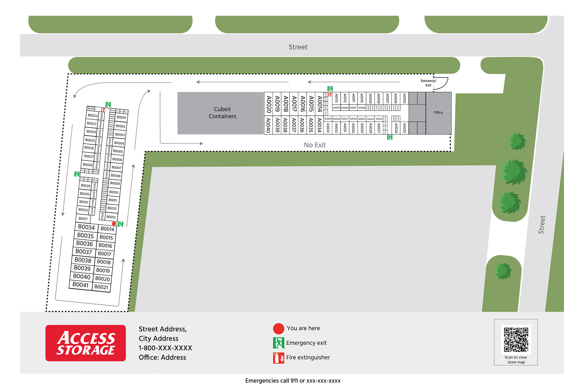
Printable Wayfinding Maps
Full-detail maps of the facility including all individual storage units, labelled with unit numbers. Designed for customer use at the front desk, included in welcome packets, or available online as PDFs. Clear legend and directional indicators for ease of understanding. Facility sections and paths colour-coded for quick reference.
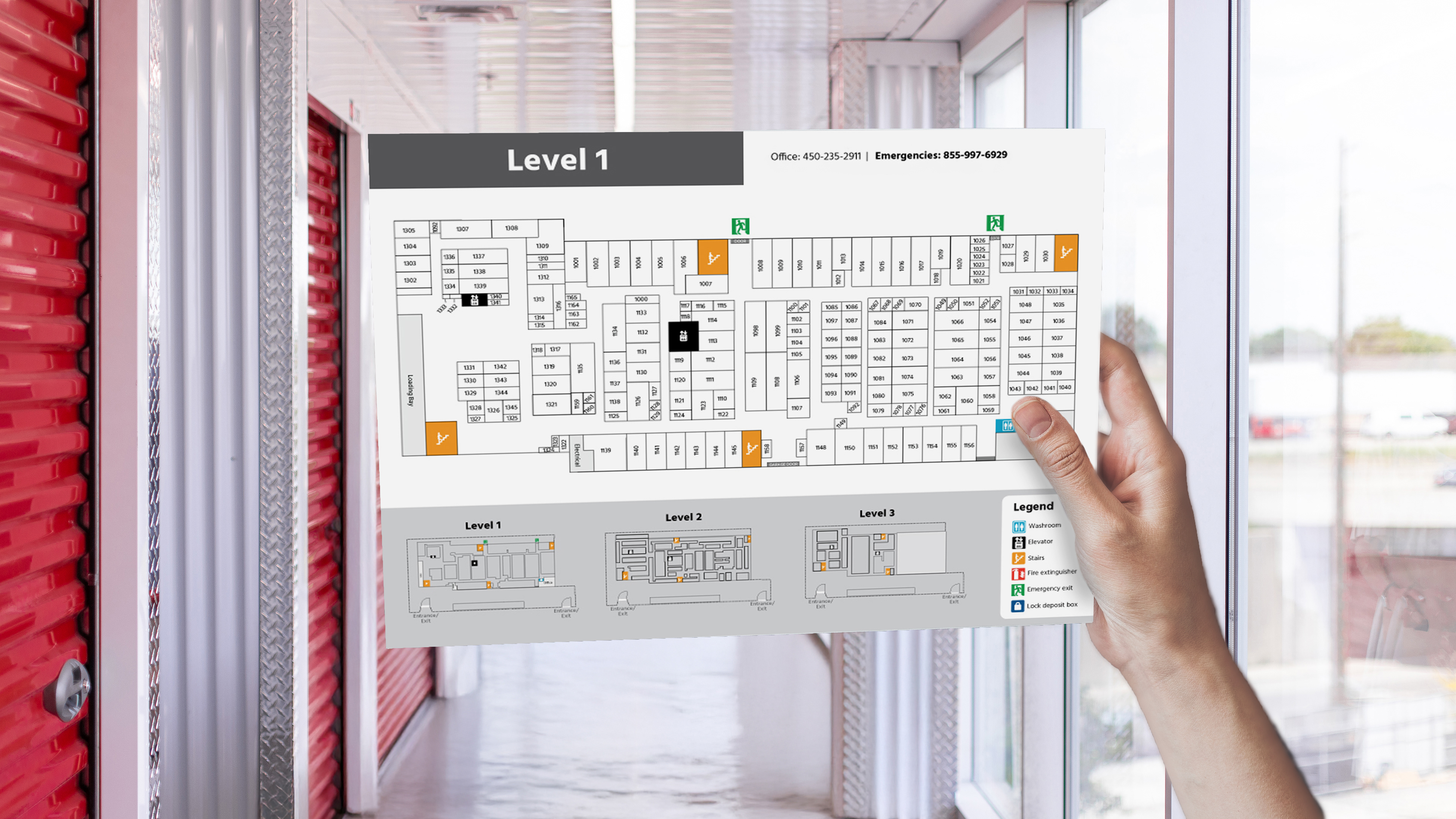
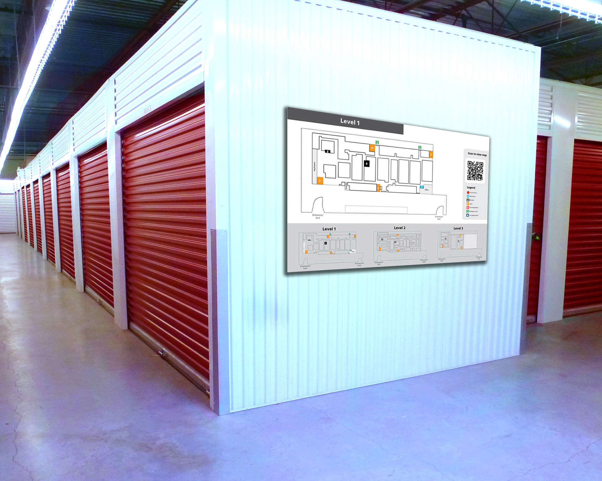
Wall-Mounted Maps
Strategically placed throughout the facility at key entry points and decision areas (e.g., elevators, stairwells, main corridors). Simplified layout showing major zones and directional flow, with “You Are Here” indicators. Unit numbers shown in grouped blocks for orientation without overwhelming detail. Durable and weather-resistant materials for indoor/outdoor display.

Emergency Exit Maps
Designed to provide clear, immediate guidance to occupants during an emergency, ensuring a safe and efficient evacuation. It prioritizes simplicity, visibility, and universal comprehension. These maps are placed in every indoor facility hallway to be in compliance with Canadian federal health and safety regulations. These maps are marked with red arrows to guide the viewer to the nearest emergency exit.
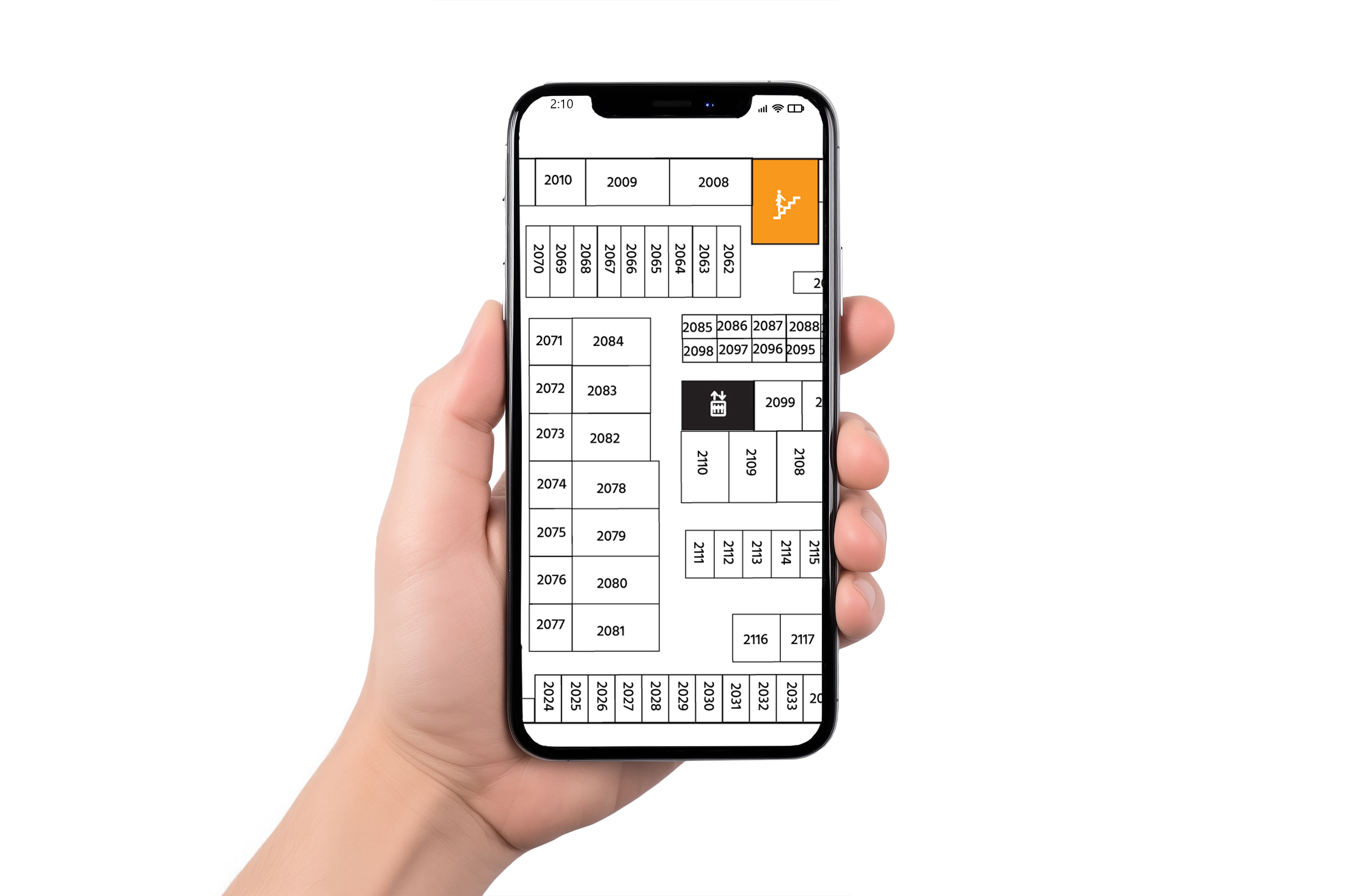
Digital Maps
Mobile and desktop friendly maps accessible via QR code on signage or client accounts.

Directional Signs
To help users navigate the facility more easily, directional wayfinding signs were implemented as a core part of the system. These signs provided clear, concise arrows and labels pointing toward key destinations such as unit ranges, elevators, exits, and facility amenities. Strategically placed at decision points like hallway intersections and entryways the signs reduced hesitation and confusion, allowing users to move confidently through the space. Consistent typography and iconography ensured quick recognition and improved overall flow within the facility.