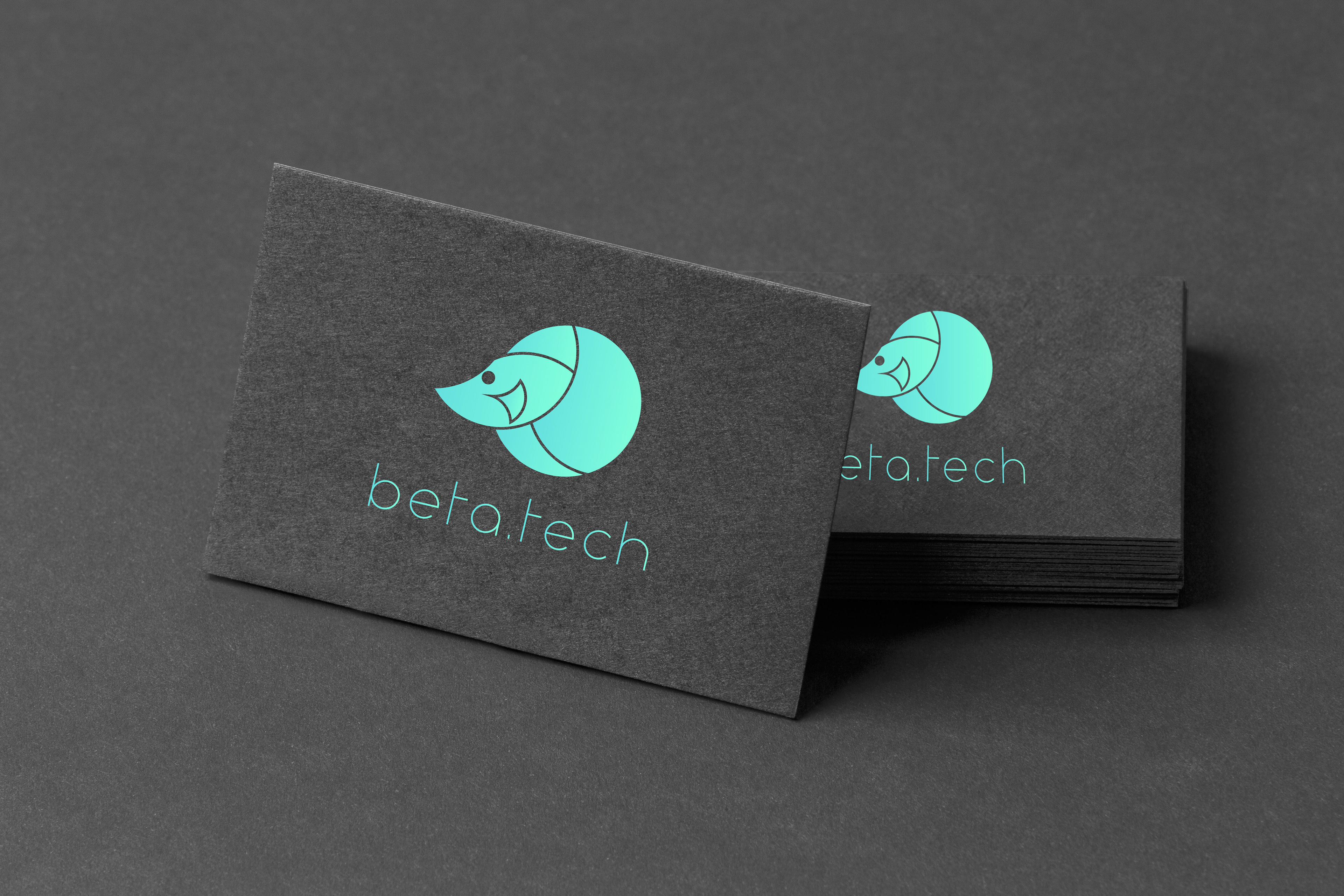
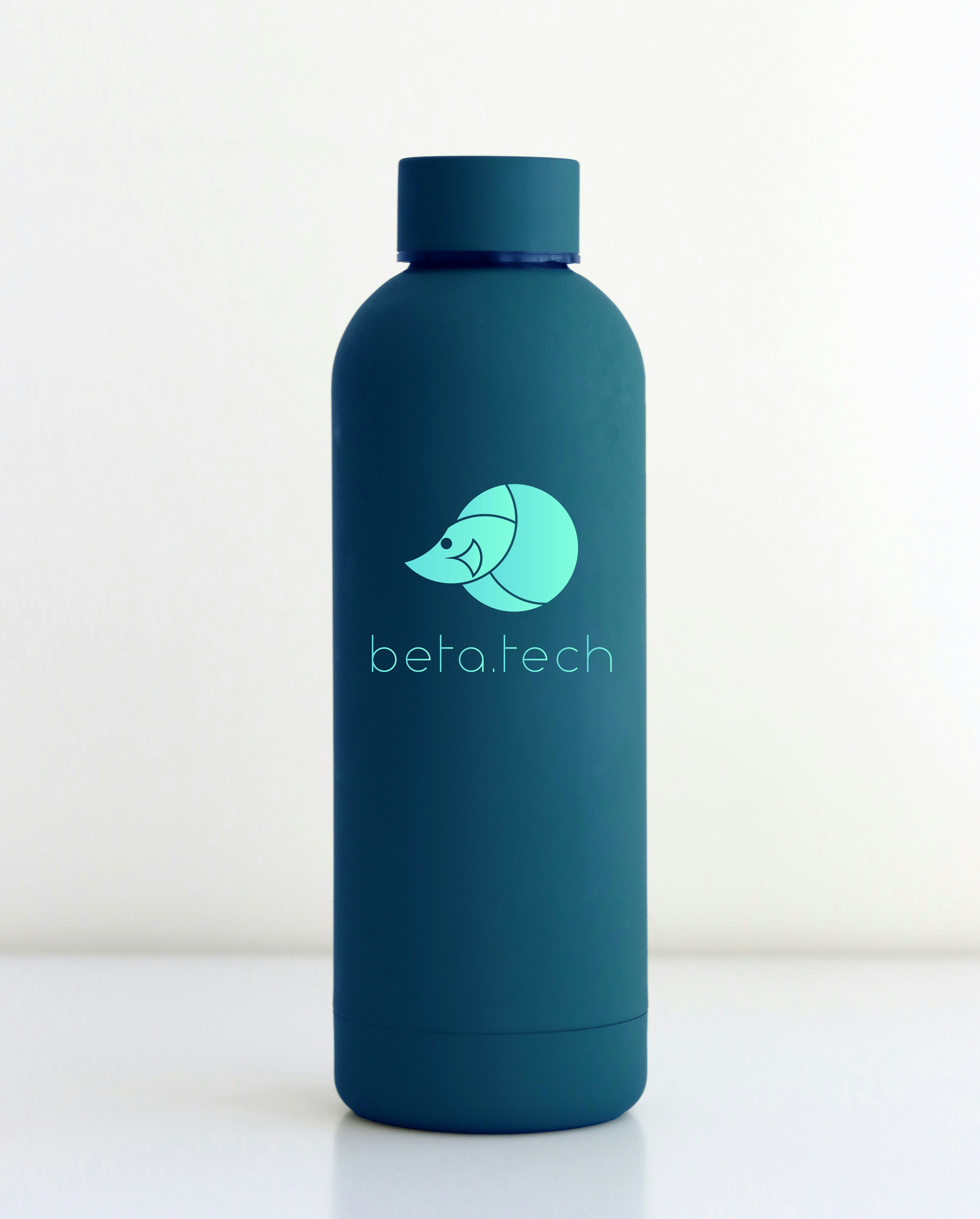
This brand identity was created for a tech startup specializing in app functionality and quality assurance testing. The design emphasizes precision, clarity, and innovation—core values for a company focused on optimizing digital performance.
The logo is constructed using circles derived from the golden ratio, symbolizing mathematical accuracy and balance—an ideal representation of the startup’s systematic approach to testing. Its clean, geometric structure also suggests technical confidence and scalability.
A teal and turquoise color palette was chosen to convey a sense of trust, clarity, and modernity. These cool hues reflect the brand’s calm confidence and digital focus, while also standing out in the tech landscape. The typography is modern and minimal, complementing the geometric nature of the logo and reinforcing a clean, user-friendly aesthetic.