
For the month of July, I created the visual assets for a national “Celebrating Canada” campaign designed to highlight the Access Storage’s strong Canadian identity. The campaign featured a unified design system that was adapted across multiple channels, including billboards in key regions, still-image ads broadcast on national news networks, and placements in community booklets for local outreach. By combining a cohesive visual style with recognizable national symbols, the campaign expressed the brand’s “Canadianess” in a way that felt both familiar and fresh, fostering an immediate emotional connection with audiences during Canada’s most patriotic month.
CanadaScape Leaf
At the core of the campaign was a custom maple leaf illustration featuring iconic Canadian landscapes and monuments integrated within its shape. This design served as a bold visual metaphor capturing both national pride and the company’s deep connection to Canadian communities.

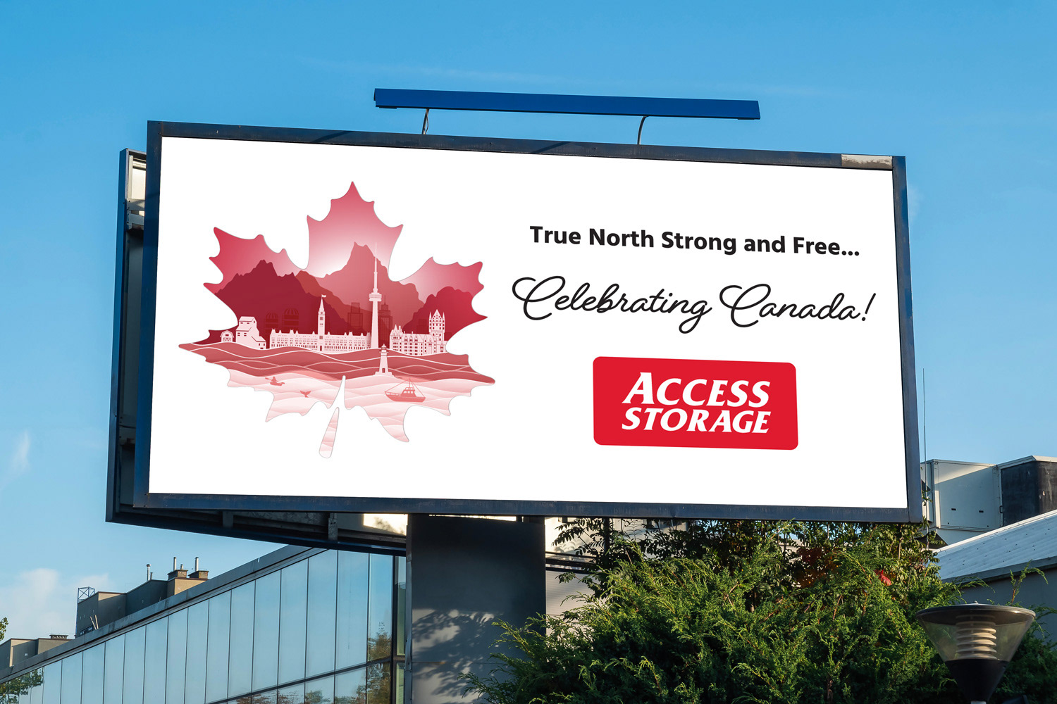
Billboards
I designed large-format billboards that were strategically placed in key regions to maximize visibility and reinforce the campaign’s national presence. Working with the scale of outdoor advertising, I ensured clarity and impact from a distance while maintaining visual richness up close. The bold use of Canadian landmarks within the leaf created an immediate association with national pride, making the creative both eye-catching and memorable for commuters and pedestrians. By aligning the visuals with the surrounding environment, the billboards acted as high-visibility touchpoints that amplified the campaign’s celebratory message throughout the month of July.
Still-image ads featured on national news networks
As part of the campaign rollout, I designed a series of still-image ads that were broadcast on national news networks. These visuals needed to be clear, bold, and immediately recognizable since they appeared briefly on-screen during high-viewership programming. I focused on creating strong, eye-catching compositions that highlighted the campaign’s maple leaf design while ensuring legibility and brand consistency across various screen formats. By balancing striking imagery with concise messaging, the ads successfully carried the campaign’s celebratory tone to a wide national audience.

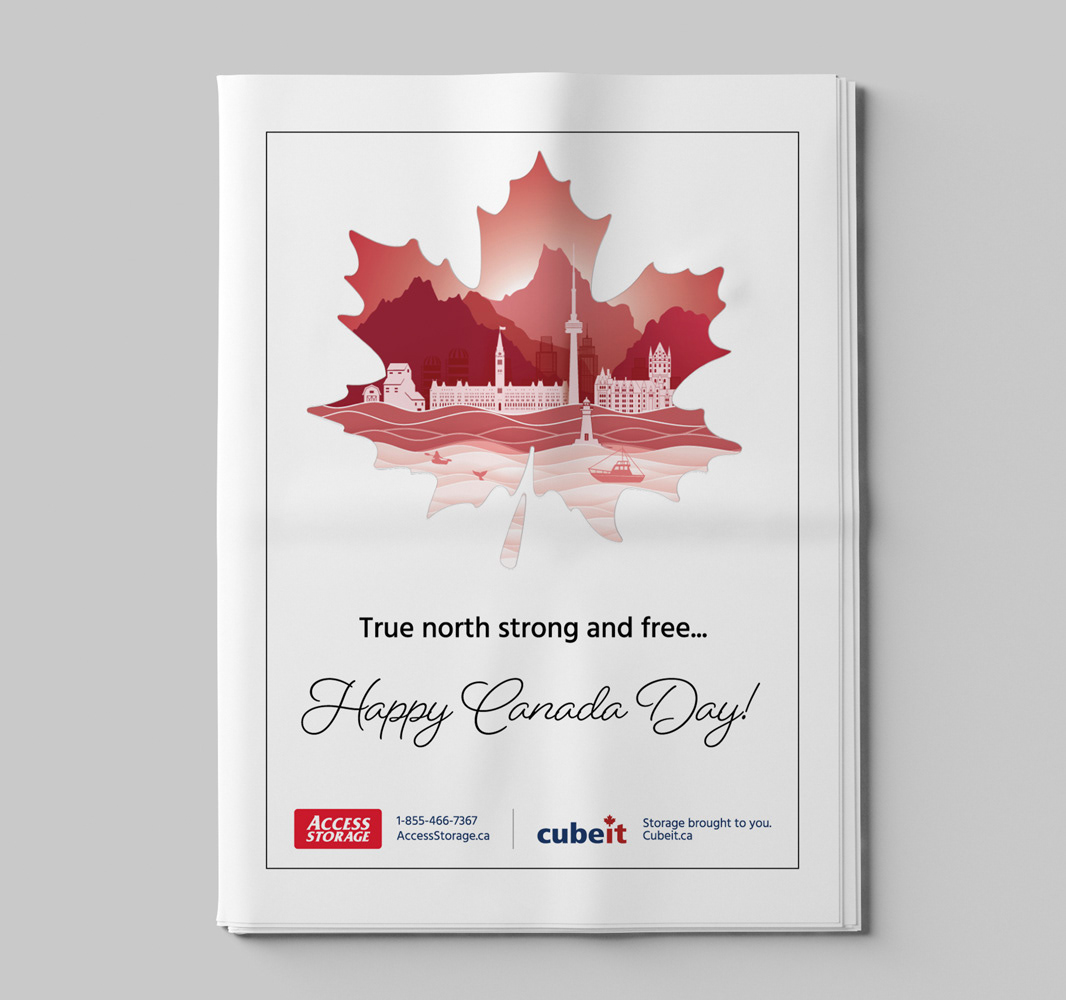
Community booklet placements
For local outreach, I created print ads for community booklets that were distributed to households and local organizations. These placements required a more intimate design approach compared to billboards or broadcast media, as readers engaged with the ads at a closer range and for a longer period of time. I adapted the campaign’s visual identity to fit smaller, print-friendly formats, ensuring the maple leaf illustration and supporting brand elements remained clear and impactful without losing detail. The booklet ads emphasized accessibility and familiarity, helping the brand connect with audiences on a local, community level while reinforcing the broader national campaign.